
11 minutes
As the weather warms up, it’s time to set aside the heavy wool and thick layers of drab winter clothing. In the spring, lighter fabrics like cotton and linen become staples in our wardrobes in colors that feel fresh and optimistic. This year, spring color trends are again inspired by the hues found in nature during the season of renewal. They evoke feelings of vitality, reflecting the blooming flowers, tenacious foliage, and clear skies that characterize this time of year.
Ready, Set, Bloom!
Flowers are in full bloom during spring, and fashion follows suit with floral prints adorning dresses, pants, and tops. Go here for more on all of the top trends this season, beyond the spring color trends.
As spring weather can be unpredictable, layering becomes key. A lightweight cardigan or denim jacket paired with a breezy top provides just the right amount of warmth during cooler moments, while still allowing you to shed layers as the day progresses.
Finish off your look with the right shoes and accessories. In spring, footwear transitions from bulky boots to lighter options that reflect the season’s breezy vibe. Ballet flats, espadrilles, canvas sneakers, and ankle boots become go-to choices, offering both style and practicality. Swap out heavy scarves and beanies for a lightweight kimono and a woven hat.
Top 6 Spring Color Trends
Pistachio
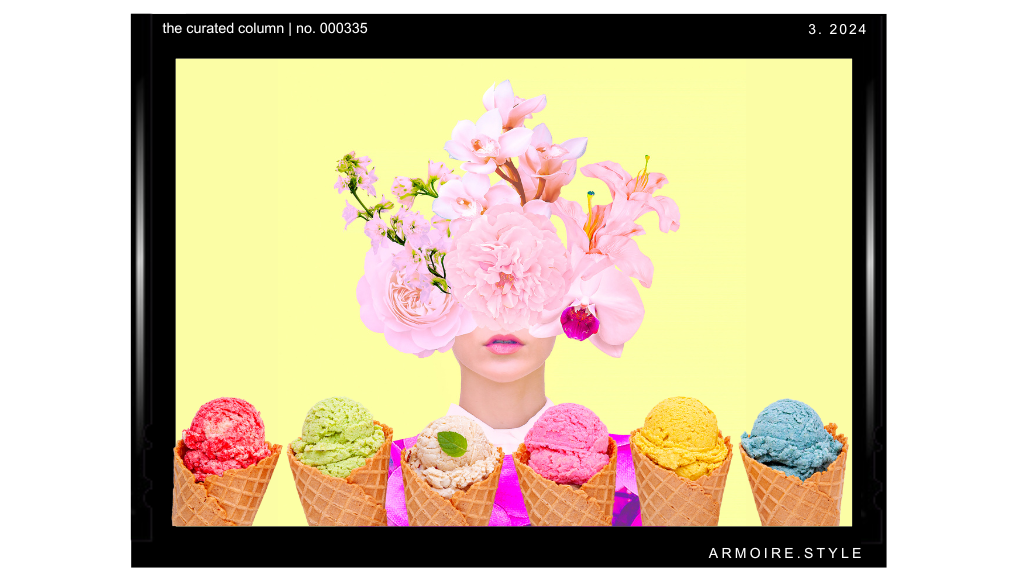
Pistachio is a pale green color reminiscent of the hue of the outer shell of the pistachio nut. It is a soft and muted shade of green with a slight yellow undertone, resembling the color of the inner flesh of a ripe pistachio nut. The color pistachio can vary in intensity, ranging from a very light, almost pastel green to a slightly deeper, more saturated shade.
When visualizing pistachio, imagine a gentle, calming green with a subtle warmth, similar to the tender green leaves of spring or the soft green tones found in certain types of pottery. It’s a versatile color that can evoke feelings of freshness, tranquility, and natural beauty.
Pistachio Pairings
- Ivory: This neutral tone provide a soft and elegant contrast to pistachio, creating a serene and sophisticated palette.
- Soft Peach: Peach adds warmth to pistachio while maintaining a gentle, pastel aesthetic.
- Dusty Rose: The softness of dusty rose complements the muted green of pistachio beautifully, creating a vintage-inspired palette that feels romantic and nostalgic.
- Brass: Adding metallic accents in brass enhances the warmth of pistachio, adding a touch of luxury and dimension.
Sunny Yellow
Sunny yellow is a vibrant and cheerful shade that evokes the warmth and brightness of the sun. It’s a bold and energetic color that resembles the radiant glow of sunlight on a clear day, making it worthy of a permanent spot on the spring color trends list. Imagine the intense yellow hue of a sunflower or the golden rays of the morning sun.
Sunny yellow is characterized by its vividness and warmth. It is often associated with feelings of joy, optimism, and happiness. This color can instantly uplift the mood and add a lively and spirited vibe to any space or object it adorns.
Visually, sunny yellow is a pure and saturated yellow hue with a high level of brightness. It tends to be rich and intense, without being overly neon or fluorescent. Sunny yellow can range from a golden yellow reminiscent of ripe lemons to a brighter, sunnier hue that captures the essence of a cloudless summer sky.
In terms of its emotional impact, sunny yellow is known to stimulate creativity, promote positivity, and evoke a sense of warmth and friendliness. It is often used in design to create focal points, add accents, or infuse looks with energy and vitality.
Sunny Yellow Pairings
- Sky Blue: Pairing sunny yellow with a soft, light blue reminiscent of the sky creates a cheerful and uplifting combination. The contrast between the warm yellow and cool blue evokes a sense of tranquility and freshness.
- Coral: Coral is a warm and lively color that pairs beautifully with sunny yellow. This combination creates a vibrant and energetic palette that feels playful and youthful.
- Mint Green: Soft, pastel shades of mint green complement sunny yellow with a refreshing and calming effect. This combination evokes a sense of springtime and natural beauty.
- Terracotta: Warm terracotta tones harmonize beautifully with sunny yellow, creating a cozy and inviting color scheme reminiscent of sun-drenched Mediterranean landscapes.
Millennial Pink
Partly due to the enormous success of the 2023 Barbie and Mean Girls movies, we’re all loving everything pink. It’s no surprise that a shade of pink is one of the top spring color trends. Which shade, you might be wondering? Millennial pink, also known as “Tumblr pink” or “Scandi pink,” gained popularity in the early 2010s and became a defining color of the millennial generation. It’s a soft, muted shade of pink with undertones of beige or peach, giving it a subtle and sophisticated appearance.
Describing millennial pink involves visualizing a delicate and dusty pink hue that is often described as a “blush” or “pastel rose.” It’s a color that is neither too vibrant nor too pale, striking a balance between warmth and subtlety. Millennial pink can vary in intensity, ranging from a very light, almost nude pink to a slightly deeper, more saturated shade.
This particular shade of pink has gained popularity across various industries, from fashion and design to marketing and branding. Its understated yet chic aesthetic has made it a favorite choice for everything from clothing and accessories to interior decor and branding campaigns.
Emotionally, millennial pink is often associated with notions of femininity, romance, and youthfulness, but it also carries a sense of sophistication and modernity. It’s a versatile color that can be used to create a range of atmospheres, from playful and whimsical to elegant and refined.
Millennial Pink Pairings
- Gray: Soft shades of gray provide a neutral and understated complement to millennial pink. Gray tones help to balance the softness of pink, creating a chic and elegant color scheme.
- Lavender: Soft lavender tones provide a delicate and feminine complement to millennial pink. This combination creates a dreamy and romantic color scheme that feels whimsical and enchanting.
- Red: Yes, red! in fashion, red and pink can create a bold and playful statement. Pairing a vibrant or deep red with millennial pink create a striking contrast that is visually appealing.
- Black: The soft, delicate hue of millennial pink contrasts beautifully with the intensity of black. This contrast adds visual interest to an outfit and creates a dynamic and eye-catching look.
Lilac
Lilac is a soft and delicate shade of purple with a light, airy quality reminiscent of the fragrant lilac flower. It falls within the spectrum of purple but leans more towards the lighter end, often appearing pale and pastel-like.
Visualizing lilac involves imagining a gentle, muted purple hue with a subtle hint of pink or lavender undertones. It can range from a very light, almost white tint of purple to a slightly deeper, more saturated shade, resembling the petals of the lilac flower.
Lilac is often associated with qualities such as femininity, elegance, and tranquility. It carries a sense of softness and sophistication, making it a popular choice for various applications, including fashion, interior design, and weddings.
Emotionally, lilac is known to evoke feelings of serenity, calmness, and romance. It has a soothing effect on the eyes and can create a sense of harmony and balance in a space. Lilac is often used to add a touch of elegance and refinement to a color palette, whether as a dominant hue or as an accent color.
Overall, lilac is a versatile and beautiful color that exudes a sense of grace and beauty. Its soft and gentle nature makes it a popular choice for creating serene and elegant looks, while its delicate hue adds a touch of romance and sophistication to any style.
Lilac Pairings
- Burgundy: Rich burgundy adds depth and warmth to lilac, creating a luxurious and opulent color scheme. This combination is bold and dramatic, evoking a sense of romance and indulgence.
- Teal: Teal brings a vibrant and energetic contrast to lilac. This combination is dynamic and eye-catching, adding a pop of color and excitement to any design.
- Soft Yellow: Soft yellow hues pair well with lilac, creating a delicate and uplifting color palette. This combination feels sunny and cheerful, evoking a sense of happiness and positivity.
- Slate Blue: Slate blue offers a serene and calming complement to lilac. This combination feels tranquil and peaceful, perfect for creating a soothing and harmonious atmosphere.
Powder Blue
Powder blue is a soft and gentle shade of blue that resembles the color of the sky on a clear day or the delicate petals of certain flowers. It is a pale and muted hue that exudes a sense of tranquility and serenity.
Visualizing powder blue involves imagining a light, pastel-like blue with a subtle hint of gray undertones. It is a delicate and understated color, often described as airy and ethereal. Powder blue can range from a very light, almost whitish tint of blue to a slightly deeper, more saturated shade, reminiscent of baby blue.
Powder blue is often associated with qualities such as calmness, purity, and innocence. It has a soothing effect on the eyes and can create a sense of relaxation and peace in a space. This gentle hue is commonly used in interior design, fashion, and art to evoke a feeling of lightness and simplicity.
Emotionally, powder blue is known to promote a sense of tranquility and harmony. It is a timeless and versatile color that can be used as a dominant hue or as an accent to create a serene and elegant atmosphere.
Powder Blue Pairings
- White: Crisp white serves as a clean and fresh backdrop for powder blue, allowing it to stand out and shine. This combination creates a bright and airy aesthetic that feels light and refreshing.
- Navy Blue: Deep navy blue creates a striking contrast with powder blue, adding depth and richness to the overall look. This combination is sophisticated and timeless, perfect for creating a bold yet balanced color scheme.
- Grass Green: The combination of grass green and powder blue is reminiscent of springtime, with its blooming flowers and fresh foliage. Wearing these colors together can evoke feelings of renewal, growth, and optimism, making them perfect for the spring season.
- Fresh Orange: Fresh orange and powder blue have a modern and youthful aesthetic that is stylish and on-trend. This color combination is popular in streetwear, adding a pop of personality.
Peach Fuzz
PANTONE COLOR OF THE YEAR 2024
I’ve saved the best of the spring color trends for last! “Peach fuzz” is a term used to describe a soft, delicate shade that resembles the velvety texture and gentle coloration of a peach’s skin. This color falls within the warm spectrum, combining soft peach tones with hints of light orange or pink.
Visualizing peach fuzz involves imagining a subtle and muted hue that evokes the softness and warmth of a ripe peach. It is a gentle and inviting color that often leans towards pastel territory, with a delicate balance between peach, pink, and orange undertones.
Peach fuzz can vary in intensity, ranging from a very light, almost nude peach to a slightly deeper, more saturated shade reminiscent of the outer skin of a peach. It carries a sense of warmth and sweetness.
Emotionally, peach fuzz is associated with qualities such as softness and femininity. It has a soothing effect on the eyes and can create a sense of comfort and relaxation. Peach fuzz is often used to add a touch of softness and elegance to color palettes, whether as a dominant hue or as an accent color.
Peach Fuzz Pairings
- Cream: Cream or ivory tones provide a soft and elegant backdrop for peach fuzz, creating a warm and cozy look. This combination feels classic and timeless.
- Gold: Metallic gold accents add a touch of luxury and glamor to peach fuzz. Gold enhances the warmth of peach fuzz while providing a sophisticated and elegant touch.
- Soft Pink: Soft pink tones complement peach fuzz with a delicate and romantic effect. This combination creates a dreamy and feminine palette that feels charming and enchanting.
- Sage Green: Soft, muted shades of sage green offer a natural and calming complement to peach fuzz. This combination creates a soothing and harmonious palette that feels serene and tranquil.
Spring is synonymous with soft, pastel colors that mirror the blossoming flowers and budding foliage. Pastel pinks, blues, yellows, and greens dominate spring fashion, adding a touch of sweetness and femininity to your outfits. Whether it’s a blush pink dress or a powder blue blouse, pastel hues evoke the freshness and vitality of the season.
The spring color trends are filled with lightness, color, and the promise of new beginnings. It’s time to refresh your wardrobe with breathable fabrics, pastel hues, and versatile pieces that celebrate the beauty and vibrancy of the season.


